
How to Set Up Magento 2 Different Theme for Mobile?
63% of online traffic comes from mobile devices? Magento 2 different theme for mobile ensures that your Magento store is mobile-ready for a better mobile experience.
In this tutorial, we will explore the configuration steps and top Magento 2 different themes for mobile.
Key Takeaways
-
Magento 2 supports themes tailored for mobile users to boost performance.
-
A mobile theme in Magento enhances usability with touch-friendly designs.
-
Google’s mobile-first indexing prefers mobile-optimized websites for better rankings.
-
A mobile-specific theme improves conversions with simplified navigation.
-
Learn to set up different themes for mobile in just six steps.
What is Magento 2 Different Theme for Mobile?
Magento 2 allows using a different theme for mobile devices to improve user experience and site performance. A mobile-specific theme ensures the design, layout, and navigation are optimized for smaller screens. It offers faster load times and better usability.
The approach caters to the growing number of mobile users and aligns with Google’s mobile-first indexing. Magento 2 can automatically load the designated theme for mobile visitors. It is by configuring mobile user agents.
The feature enhances brand consistency, improves accessibility, and helps boost conversions. It delivers a smooth experience tailored to mobile audiences that is distinct from the desktop theme.
Why Use a Different Theme for Mobile in Magento 2?
1. Enhanced User Experience
-
A mobile-specific theme ensures that the design is optimized for smaller screens. It helps provide a clean and clutter-free interface.
-
Several features make browsing easier for mobile users. These include:
1. Larger fonts
2. Touch-friendly buttons
3. Simplified navigation
-
The tailored experience reduces frustrations like excessive scrolling or zooming. It leads to higher satisfaction.
2. Improved Performance
-
Mobile devices often operate on slower networks, making page load times essential.
-
Mobile-specific themes are designed with lightweight assets. It reduces the time taken for a page to load.
-
It keeps users engaged and decreases bounce rates. It can negatively impact your store’s performance.
3. Higher Conversion Rates
-
Customers are more likely to complete their purchases when the browsing and checkout processes are effortless.
-
A mobile-optimized theme removes barriers by offering features like:
1. Easy product filtering
2. Simplified forms
3. Intuitive navigation
-
It directly improves your conversion rates.
4. SEO Benefits
-
Google’s mobile-first indexing emphasizes the importance of mobile-optimized websites.
-
A separate mobile theme aligns with this approach. It offers:
1. Faster load times
2. Better usability
3. Fewer errors
-
These factors contribute to higher rankings. It makes your store more discoverable to potential customers.
5. Catering to Mobile Traffic
-
Mobile devices account for a significant portion of eCommerce traffic. Neglecting mobile users can hurt your business.
-
A dedicated mobile theme addresses their specific needs. It ensures your store meets modern shopping habits and expectations.
6. Custom Features for Mobile Users
-
Mobile-specific themes allow you to introduce features tailored to mobile browsing behavior.
-
Several features improve functionality and usability for on-the-go shoppers. These include:
1. Simplified navigation menus
2. Sticky "Add to Cart" buttons
3. Quick access to customer support
7. Brand Consistency Across Devices
-
The layout and design elements differ between desktop and mobile themes.
-
Maintaining consistent branding in colors, logos, and fonts helps reinforce your brand identity.
-
The consistency assures customers that they are interacting with the same trusted store, no matter the device.
8. Competitive Advantage
-
Many businesses rely on responsive designs. A dedicated mobile-specific theme provides a competitive edge.
-
It allows you to optimize every detail specifically for mobile users.
-
It helps create a more refined and user-focused experience that can set your store apart from competitors.
9. Optimized Layouts
-
Mobile-specific themes are designed to fit smaller screens. It ensures better readability and navigation.
-
Elements like menus, text, and images are resized to provide a smooth browsing experience. It doesn’t require users to zoom or scroll excessively.
10. Automatic Switching
-
Magento 2 allows you to configure mobile user agent rules that detect the device type. It also helps automatically load the appropriate theme.
-
It ensures a smooth transition for users visiting your site on different devices.
6 Steps to Set a Different Theme for Mobile in Magento 2
1. Log in to the Magento 2 admin panel with appropriate credentials.
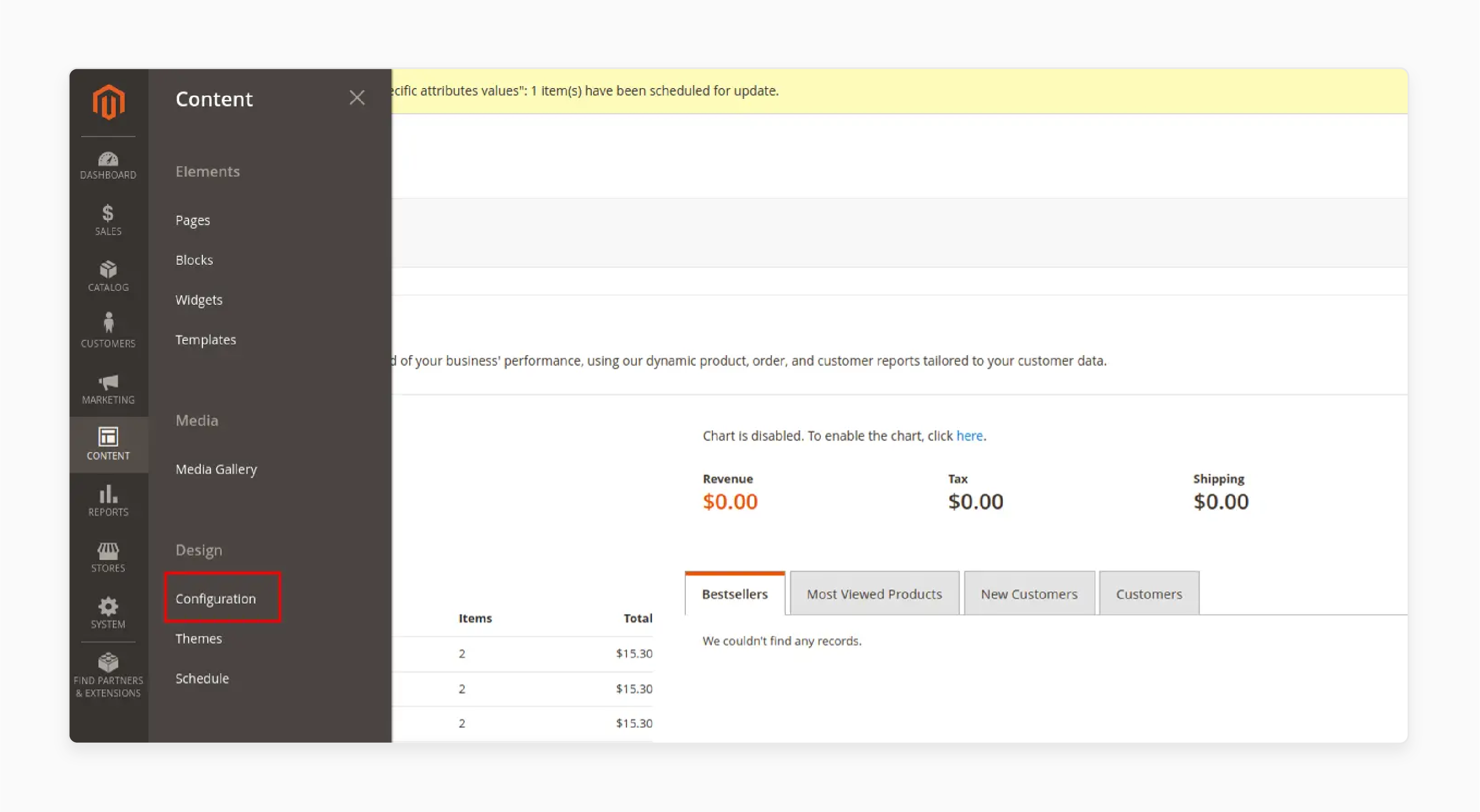
2. Go to Content > Design > Configuration.
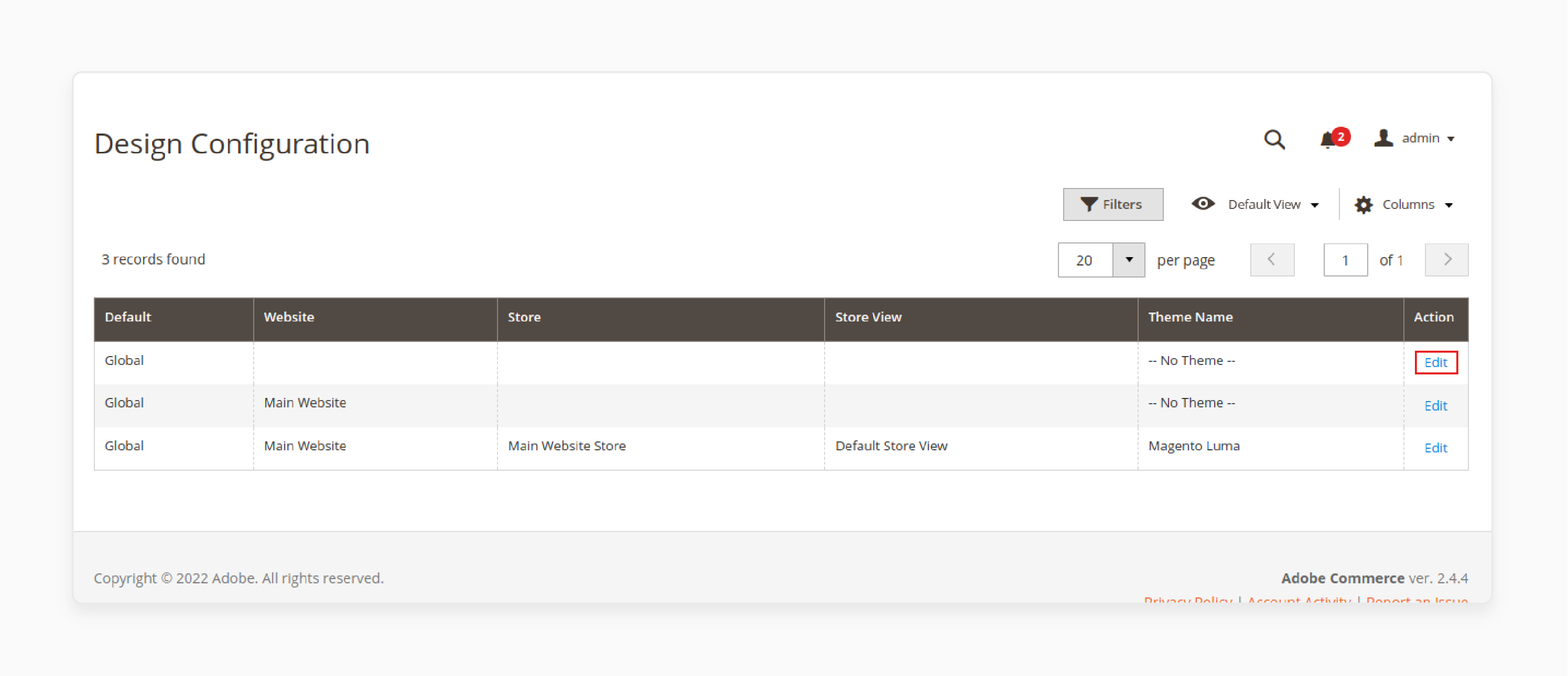
3. Click on the Edit button of the first row(Global) or the store for which you would like to apply the mobile theme.
4. Open the Design Rule tab and click Add New User Agent Rule.
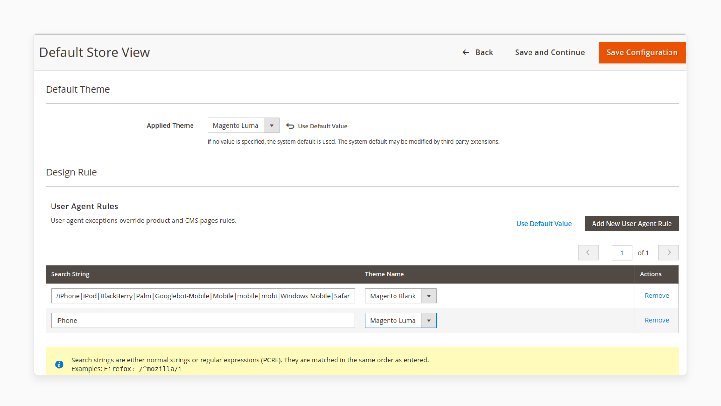
5. Add the below string or specify a particular device name.
/iPhone|iPod|BlackBerry|Palm|Googlebot-Mobile|Mobile|mobile|mobi|Windows Mobile|Safari Mobile|Android|Opera Mini/
6. Then select your desired theme.
Top 2 Magento 2 Mobile Themes
1. Mogent: Mobile-ready Magento template - Mojoomla
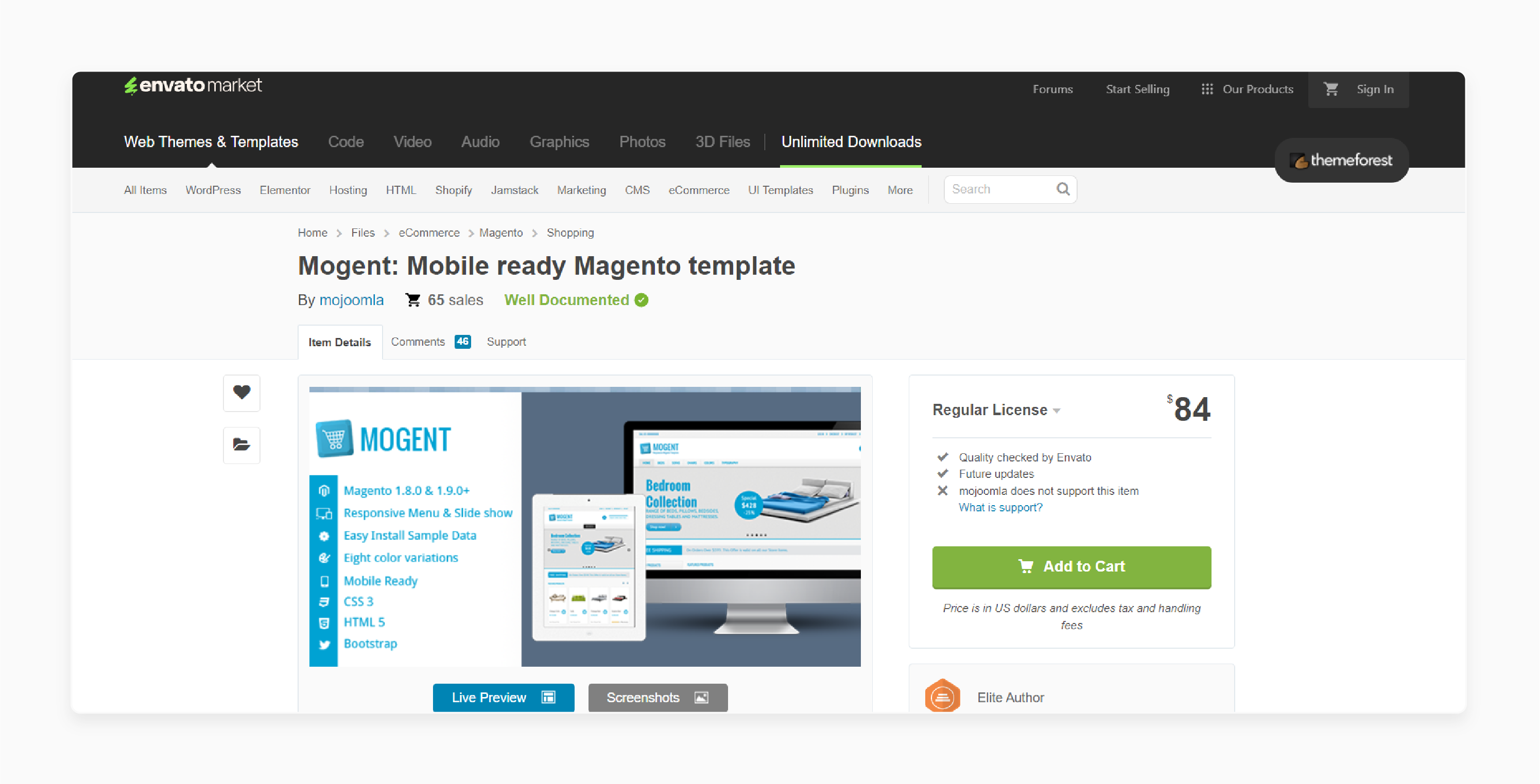
Mojoomla’s Mogent is a responsive HTML5 Magento template. It is packaged with quick starter sample data and a responsive theme. It is a fully responsive template with eight background colors and combinations in style. It comes with mobile-optimized Magento product pages, cart, and sidebox support. It has more than 20 Module positions and variations. The theme also comes with a mobile-optimized slideshow & menu. It is compatible with Magento 2.4.x.
Key Features:
-
Solid grid system and Bootstrap framework
-
Store, brand, and product TAB section
-
Checkout, shipping, and information pages
-
Shortcodes to style content
-
Google fonts support
-
Currency converter
-
Quick install
-
Layered PSD file
-
960px grid system
-
Social media support
-
Built-in Facebook feature
Price: $84 (12 months)
2. Destino - Premium Responsive Magento Theme with Mobile-Specific Layouts - Magentech
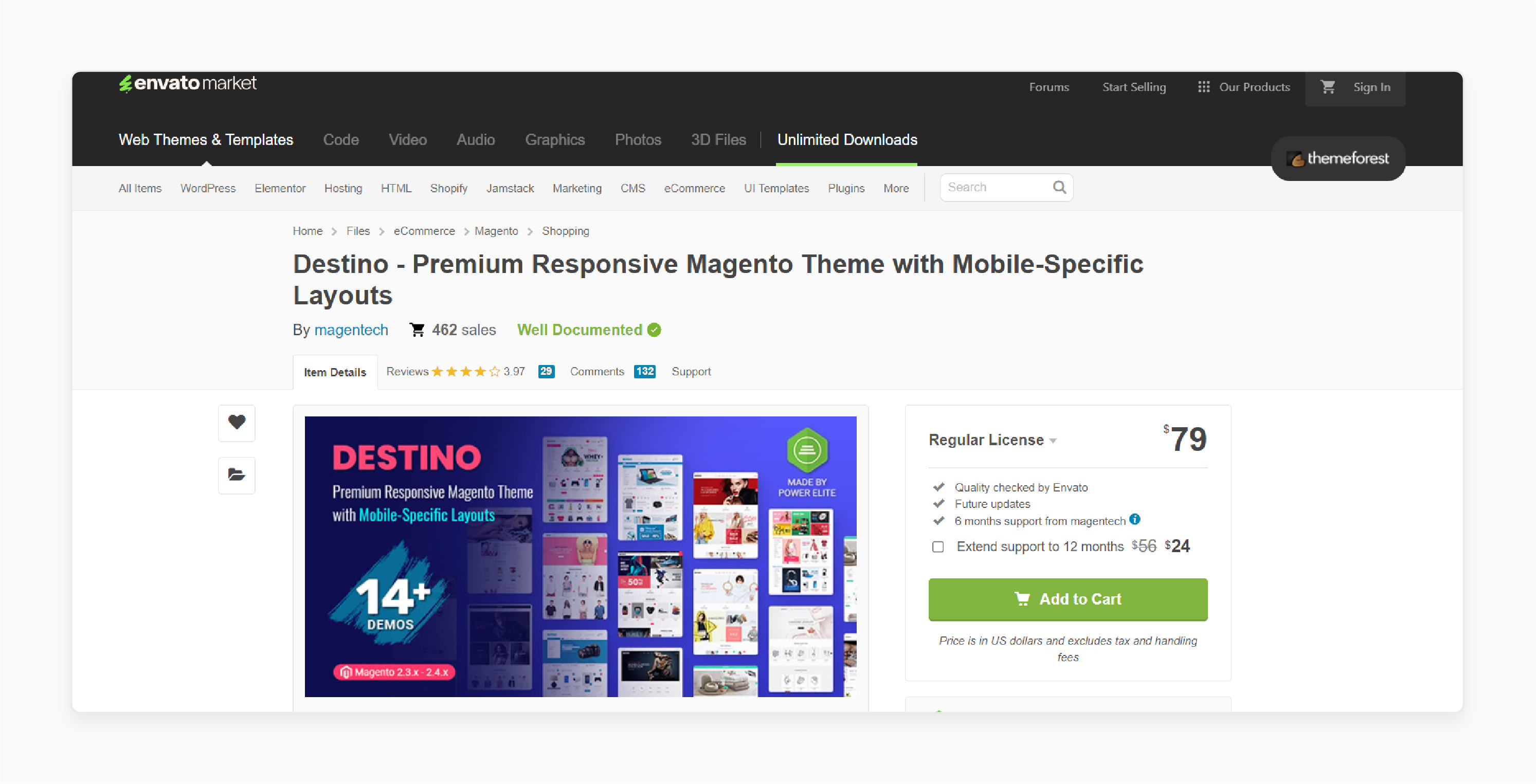
Magentech’s Destino is a clean and bright Magento 2 and 1.9 theme. It is perfectly suitable for selling digital, hi-tech, fashion, clothing, accessories, and furniture products. The eCommerce theme allows you to easily build and customize your online shop with lots of excellent features:
-
Unlimited colors
-
14+ homepage designs
-
12 header and 12 footer styles
-
Multiple listing and product layouts
You will be able to make the best combination solution with these available options for your store. It is compatible with Magento 2.1.3, 2.1.4, 2.1.5, 2.1.6, 2.1.7, 2.1.8, 2.1.9, 2.2.0, 2.2.6, 2.3.0, 2.3.1, 2.3.2, 2.3.3, 2.3.4, 2.3.5, 2.3.6, 2.4.0, 2.4.1, 2.4.2, 2.4.3, 2.4.4, 2.4.5, 2.4.6, 2.4.7.
Key Features:
-
Support 3 layouts for the category page and detail page
-
Support wide and boxed layout
-
Support Mega Menu and Css Menu
-
AjaxCart Pro includes Ajax Add to Cart, Wishlist, Compare, QuickView
-
Support multi-currency and multi-language
-
Integrated Google fonts
-
Supports 6 different types of product profile
-
Responsive layout for PCs and mobiles
-
Custom 404 page
-
Custom wishlist page, cart page, and contact page
-
Product labels on the product page, in categories, and on other product listings
-
Support Cloud Zoom and Pop-up images on the detail page
-
Delivered with source Adobe PSD files
-
Grid / List view
-
Social links allow you to share links to your profiles on social networks.
-
Cross-browser
Price: $79 (12 months)
Common Challenges and Solutions for Magento 2 Different Themes for Mobile
1. Device Detection Issues
-
Accurately detecting mobile devices to apply the appropriate theme can be tricky.
-
Inconsistent detection may result in incorrect theme rendering.
Solution:
-
Use reliable user agent detection libraries or extensions.
-
Leverage Magento's built-in Design Exceptions under Content > Design > Configuration. It helps specify the theme for mobile user agents.
-
Regularly update the user agent list to cover new devices.
2. Performance Impact
Switching themes dynamically might increase load time and server resource usage.
Solution:
-
Optimize both themes for speed by minimizing CSS, JavaScript, and image sizes.
-
Caching mechanisms like Varnish Cache or Full Page Cache can be used to reduce server load.
-
Implement lazy loading for images and resources on the mobile theme.
3. Maintaining Consistency
Keeping content, functionality, and branding consistent between desktop and mobile themes can be complex.
Solution:
-
Use the same CMS blocks and widgets across themes whenever possible.
-
Test frequently to ensure consistent layouts and functionality.
-
Set up a shared codebase for reusable elements to avoid discrepancies.
4. SEO and Duplicate Content
Having separate themes may cause duplicate content issues if URLs differ or content is inconsistent.
Solution:
-
Ensure the same URLs are used for desktop and mobile themes.
-
Use canonical tags to indicate the primary version of a page. Follow Google’s guidelines for mobile-first indexing.
5. Complex Customization
Customizing a separate theme for mobile can be time-consuming and error-prone.
Solution:
-
Plan the mobile theme with a mobile-first approach to reduce unnecessary complexities.
-
Use modular CSS and JavaScript to allow easier customization. Test changes in a staging environment before deploying to production.
6. Testing Across Devices
Ensuring the mobile theme works perfectly on all devices with varying screen sizes is challenging.
Solution:
-
Use tools like BrowserStack, Google’s Mobile-Friendly Test, or Lighthouse for testing.
-
Test manually on real devices for accuracy. Regularly update the theme to address compatibility issues.
7. Extensions Compatibility
Not all third-party extensions work well with separate themes.
Solution:
-
Choose extensions that support responsive or mobile-specific designs.
-
Work with developers to ensure compatibility with both themes.
-
Test extensions thoroughly on both desktop and mobile themes.
8. Increased Maintenance Efforts
Maintaining two themes can double the workload for updates, bug fixes, and upgrades.
Solution:
-
Use shared assets like CSS and JavaScript between themes to reduce redundancy.
-
Keep documentation for each theme to simplify maintenance tasks.
-
Consider using a Progressive Web App (PWA) for a unified design approach.
FAQs
1. How can I set up a separate theme for desktop and mobile in Magento 2?
You can set up a separate theme for Magento 2 by configuring user agent rules. It allows you to load a mobile-specific theme for better usability. Choose a mobile theme that offers lightweight assets and responsive designs.
2. Why use a mobile theme for Magento 2?
A mobile theme for Magento improves usability and performance for mobile users. It offers features like touch-friendly buttons and faster load times. It helps your Magento 2 store stand out and achieve better Google Page Speed scores.
3. Can I add a mobile theme to an existing Magento 2 store?
You can add a mobile theme to your Magento 2 store by selecting a custom theme optimized for mobile devices. Using a responsive Magento 2 theme ensures your ecommerce website works well across smartphones and desktops.
4. What are the benefits of using a theme in Magento 2 for mobile and desktop?
Using a theme for Magento 2 tailored to both mobile and desktop ensures consistent branding and usability. A custom Magento theme allows you to customize layouts fully. It helps improve core web vitals scores and offers a mobile-friendly experience for all users.
Summary
Magento 2 different theme for mobile enhances user experience and site performance. The tutorial explores the benefits of the theme, including:
-
Tailored designs enhance user experience with simplified navigation.
-
Lightweight assets ensure faster load times and reduce bounce rates.
-
Mobile themes align with Google’s mobile-first indexing for better rankings.
-
Smooth browsing features encourage purchases and boost sales.
Boost your store's mobile performance with a dedicated mobile theme. Pair it with managed Magento hosting for smooth browsing and higher conversions.


